UX/UI Design
Visitors are speed-dating your website. First impressions are the whole game. We design interfaces that get out of the way and let your product do the talking.
The difference between a website that scales and one that crumbles.
That’s what a design system is. As your business grows, your website grows with it: new pages, new campaigns, new features, new team members making decisions. Without a shared design language, that growth becomes chaos: inconsistent components, duplicated work, and a brand that looks different depending on who built what.
We design and document systems that give your team a single source of truth. Reusable components, clear guidelines, and the logic that holds it all together. Whether you’re a team of two or twenty, a design system means everyone speaks the same visual language.
This is for you if:
What you’ll get from this:
We build it in both: a Figma library with components, tokens, and documentation, plus a matching frontend implementation, so design and code never drift apart. The library covers typography, color, spacing, buttons, forms, and UI patterns, with usage guidelines and do/don’t documentation your team can reference independently.
Possibly you don’t need to start from scratch: if components exist but nobody agrees on when to use which, the gap is usage guidelines and governance, not more components. In that case we audit what you have, consolidate duplicates, and document the rules: usage guidelines, do/don’t examples, and the logic that holds the system together.
Most design system engagements run several weeks rather than days, with the exact scope tied to your real inventory. We start with an audit of your current pages and components, and that inventory determines how much consolidating, tokenizing, and documenting the system actually needs. A small marketing site and a full ecommerce catalog are very different projects.
A design system pays off any time more than one person touches the site, which is most teams past the earliest stage. For a small team the win is speed: reusable components and clear guidelines mean every new page, campaign, or feature starts from a solid base instead of from scratch. The system then scales with you as you hire.
The system is built to be extended, not frozen, so brand and product changes are expected inputs rather than emergencies. Design tokens for color, typography, and spacing let you update a rule once and have it propagate through the Figma library and the frontend implementation. New components get added following the documented patterns, so the system absorbs change instead of breaking.
A style guide is a subset of a design system, and a freelance designer can absolutely produce one. A real system also ships as working code with logic for states, responsiveness, and edge cases, plus usage guidelines and governance so the next person doesn’t improvise. If all you actually need today is a style guide, we’ll tell you that.
Visitors are speed-dating your website. First impressions are the whole game. We design interfaces that get out of the way and let your product do the talking.
Big decisions don't need long timelines. A Design Sprint compresses weeks of back-and-forth into five focused days and gets you a tested concept.
Strategy, performance, marketing, tech stack. Four potential blind spots. Blueprint surfaces what's working, what isn't, and exactly what to do about it. Take one and call us in the morning.
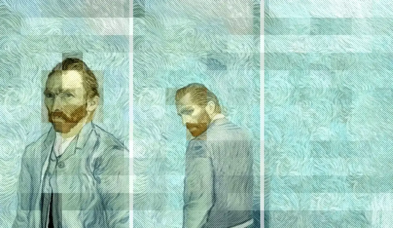
Websites that try too hard lose users, and money. Solid tips to turn digital lemons into gold, easy peasy. Plus Vincent Van Gogh analogies.
