


Marketing
The White Bunny
How the small things make the biggest difference in life, love, and business, plus why microcopy is actually a big thing.
This one is about eCommerce web design. More specifically, about UX design. User Experience (UX) is always mentioned alongside its beautiful sibling UI. But ecommerce UX design is a different thing.
UI refers to the specific visual touchpoint or asset the user interacts with. It’s commonly described as the “look and feel”, you could say the cosmetics, including color, typography, icons, buttons, or spacing, among others.
While UI focuses on aesthetics and the overall feel of the design, user experience is a much broader subject. It includes every aspect of the end user’s interaction with a company, its services and products. This means your physical store experience, your support, brand, vibe, storytelling and the actual journey from discovering a product to purchasing it.
In ecommerce it certainly includes your site’s usability, accessibility and how pleasurable or not it is for a user to interact with it, according to the site’s load or wait time, the information available and its functionality.
It needs to be (…) useful, usable, and delightful, and not necessarily in that order, but we try to encapsulate all three of those. If your site isn’t useful, no one is going to come to it. If it’s not usable, people have a hard time interacting with it. And lastly, if it’s not delightful, the loyalty of your product is not going to be what it could be.
Jason Broughton, head of UX for Zappos
eCommerce design has evolved but, in the context of ecommerce ux design, the key aspects to consider in order to deliver an ideal experience remain. Here’s an overview of the main ones:
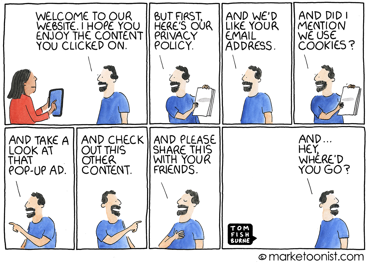
It may sound obvious, but a site that is focused on the people it’s intended for, is more likely to offer a better experience. This includes not losing sight of the real goal of the people who use your product, or in this case, your site. Case in point:
User experience design often loses sight of the actual user.
When sites optimize so much for the behavior that it wants to influence next (collecting an email address, moving people into a funnel), the reason that people come to the site in the first place can get overlooked (or buried under pop-ups).
There’s a continual balancing act between user experience and user exploitation: what is best for the user and what is best for the company. A designer has to navigate that line.
User-centric navigation is about placing the user at the heart of the design process. Imagine you enter a large supermarket for the first time; a clear layout, well-signed aisles, and an accessible information desk can make your shopping experience smooth and pleasant. It’s the same in a website: user-centric navigation aims to create a clear path through an ecommerce site, making it effortless for users to find what they’re searching for.
At the heart of user-centric navigation lies simplicity. Simple, intuitive menus, straightforward categories, and a search bar that actually understands what you’re looking for – these are the cornerstones of user-centric navigation. It’s about reducing complexity, not by removing valuable information, but by organizing it in a way that feels natural to the user.
Consistency in navigation creates a sense of familiarity and comfort. Just as you come to know the layout of your favorite local store, consistent navigation on an ecommerce site means users know where to find what they need, every time they visit. This predictability reduces frustration and builds confidence, encouraging users to explore deeper into the site.
Another key aspect of user-centric navigation in ecommerce UX design is empathy – understanding the user’s journey, anticipating their needs, and crafting an experience that feels as natural and intuitive as exploring your favorite store by keeping it simple, consistent and easy to navigate.
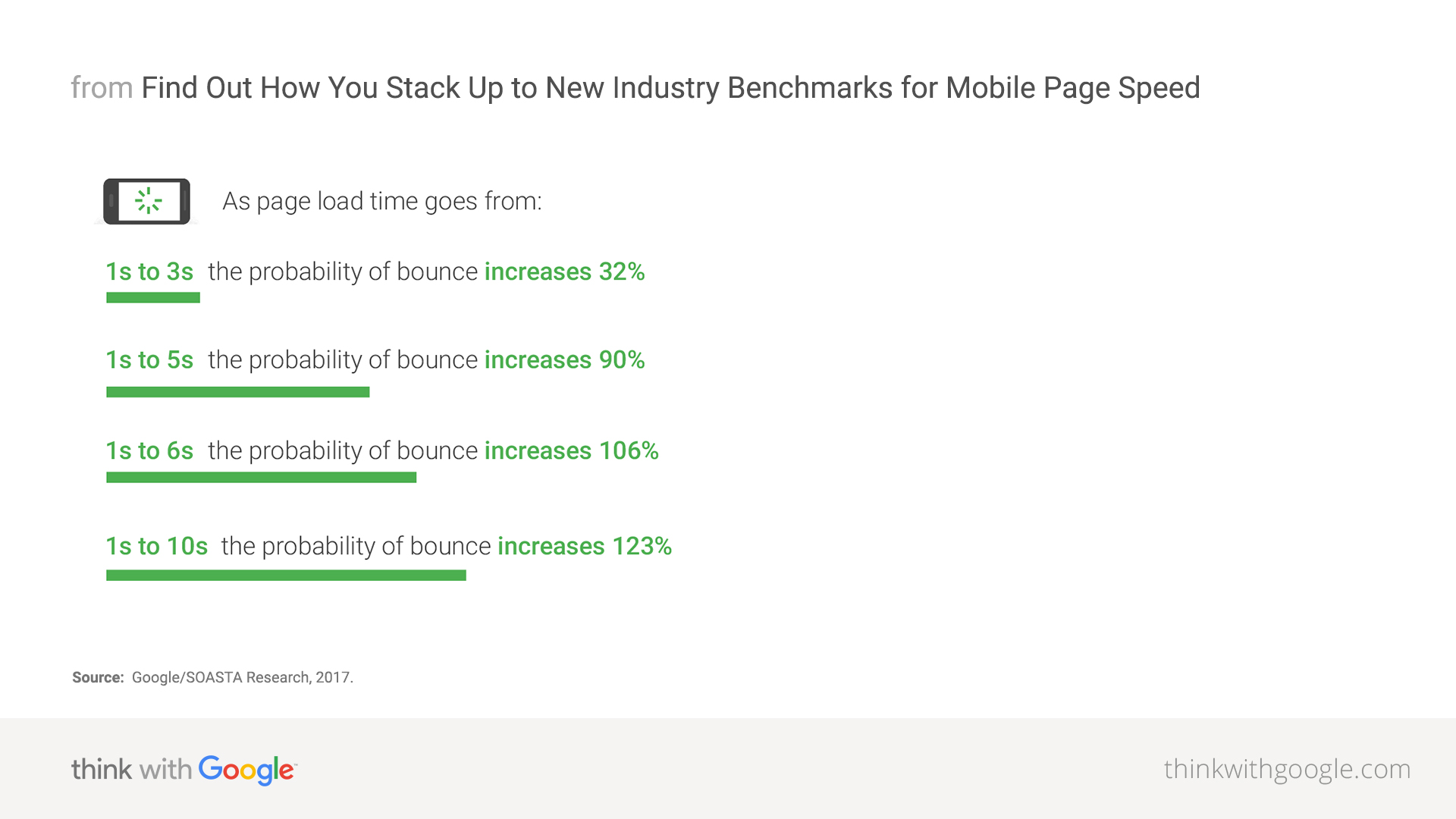
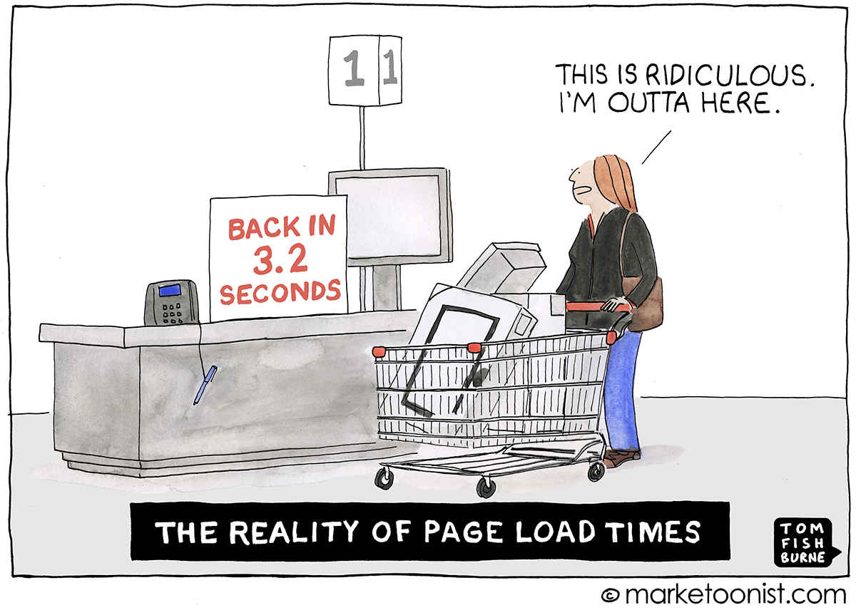
Generally speaking, “website acceptability” refers to how satisfactory or usable a website is from the user’s perspective. Specifically, it means how long your users will be willing to wait for a website to load before potentially losing interest.
A faster-loading site enhances user experience, increases engagement, and is more likely to retain visitors, which is crucial for e‑commerce success. Conversely, a slow loading website will most likely make users feel frustrated, and leave. Game over.
Slow sites= Bad UX
Therefore, every second counts, especially on mobile, and quite literally too.
“How fast your website loads is critical but often a completely ignored element in any online business and that includes search marketing and search engine optimisation. And that includes page load times on mobile devices: The average time it takes to fully load a mobile landing page is 22 seconds, according to a new analysis. Yet 53% of visits are abandoned if a mobile site takes longer than three seconds to load”.
Daniel An — Google/SOASTA research 2017
This one should be old advice by now, but you’d be amazed how many brands still fail at it:
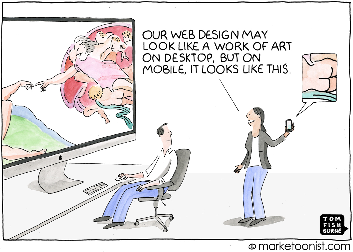
The rise of smartphones as the primary device for internet access has significantly shifted consumer behavior, making mobile responsiveness not just advantageous, but imperative for ecommerce success.
A mobile-responsive site ensures a seamless experience across all devices, whether it’s a desktop, tablet, or smartphone. This fluidity is crucial as consumers often switch devices during their purchase journey. A site that adjusts content layout, images, and navigation to fit the screen size and orientation of the device not only enhances usability but also conveys professionalism and attentiveness to customer needs. A site that doesn’t can be a problem.
(Clever) jokes aside, adopting a mobile-first approach is not shrinking a website to fit a smaller screen, but rethinking and prioritizing content and features that are most important to mobile users. This might mean simplifying menus, enhancing touch interactions, and ensuring that calls to action are prominently displayed. A mobile-first design acknowledges that space is at a premium and focuses on delivering a streamlined, intuitive user experience.
And a fast one. As mentioned, a delay of just a few seconds can lead to significant drops in engagement and sales. Moreover, evidence indicates that mobile delays could cause a 44% increase in heart rate, indicating a level of stress comparable to watching a horror movie. Which are fine if you like them, but if they’re good, they are probably quite stressful.
Another thing that speeds things up, and also happens to help users make decisions faster, which in turn helps them feel better, is simplicity. A clean, uncluttered layout with easy-to-read fonts and ample space can dramatically improve the mobile shopping experience.
Responsiveness is a must and not having it is having two of your birds killed with one stone. Mobile-friendly sites not only cater to a wide audience but also positively impact SEO, as Google prioritizes responsive design over non-responsive sites.
Visual appeal is paramount in ecommerce UX design. High-quality images and detailed product descriptions significantly impact customer decision-making and general feel.
For example, high-resolution images that offer multiple views and zoom-in functionality can mimic the in-store experience, allowing customers to closely inspect products. Make sure your website has a solid CDN to deliver images fast, so quality doesn’t tax speed and performance.
An image is worth a thousand words, but that doesn’t mean words don’t matter. Comprehensive and accurate descriptions provide necessary details to make an informed purchase decision. They should highlight key features, benefits, and any unique selling points, addressing potential questions or concerns. They are also an excellent opportunity to consolidate your brand style, voice and tone. Extra UX points if they make your users laugh. Laugh brings good feels.
You know how we use “navigate” to talk about how we deal with difficult situations? Navigate complexities, challenges, hard conversations? Yes, well, exactly the opposite. Think about navigation navigation. As in sailing with calm waters, havin’ a good time.
And just as a well-charted map is crucial for a successful voyage, a well-designed navigation system ensures users always know where they are, where they can go next, and how to return to a previously visited page, which allows them to find their way without getting lost in the depths of the site. Ok, perhaps it’s time to drop the nautical references.
(User-friendly navigation) is a cornerstone of effective ecommerce website design. Navigation is not static. It’s live and dynamic and must be regularly updated to promote your best categories. Dynamic and regularly updated navigation ensures that users can easily find and explore your best categories. Opt for an uncluttered design with smooth transitions between pages and Implement a clean and intuitive navigation structure to increase user engagement and satisfaction, which is the fuel for conversion rates.
Our eCommerce Website Design 101
The key to simple and intuitive navigation lies in understanding the user’s mindset. Users come to your site with specific goals, whether it’s finding a product, learning more about your services, or contacting your team. Your navigation should cater to these needs with clear, descriptive labels and a logical hierarchy that mirrors the thought process of your users. Dropdown menus, used sparingly, can help organize content into manageable categories without overwhelming users. Breadcrumb trails and sticky menus enhance navigation by providing context and quick access to other sections of the site, respectively. Search bars and filter options can help them find exactly what they are looking for.
A powerful search function is instrumental for a great user experience on any ecommerce site. It’s what may turn a potentially frustrating experience into a satisfying one, by allowing users to find exactly what they’re looking for with minimal effort.
It’s not just about having a search bar, but about prioritizing search functionality to make shopping more personalized and efficient in order to enhance user experience.
Some ways to do so include:
-Making the search bar easily accessible, prominently placed so users don’t have to hunt for it.
-Helping users with placeholder prompts and examples to guide their search.
- Adding auto-complete functionality to reduce the user’s effort and to help guide their search in real-time with suggestions of products, categories or content.
-Using advanced search filters to help users narrow down their search results based on specific criteria such as size, color, price range, or rating.
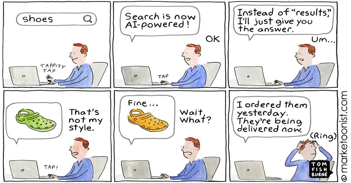
Lastly, consider integrating ecommerce AI powered tools like AdvancedCommercee or Algolia for a more powerful and personalized search experience. These platforms can analyze user behavior to deliver search results that are not just relevant but also tailored to each visitor’s preferences and previous interactions with your site. But proceed with caution.
This is not good for UX.
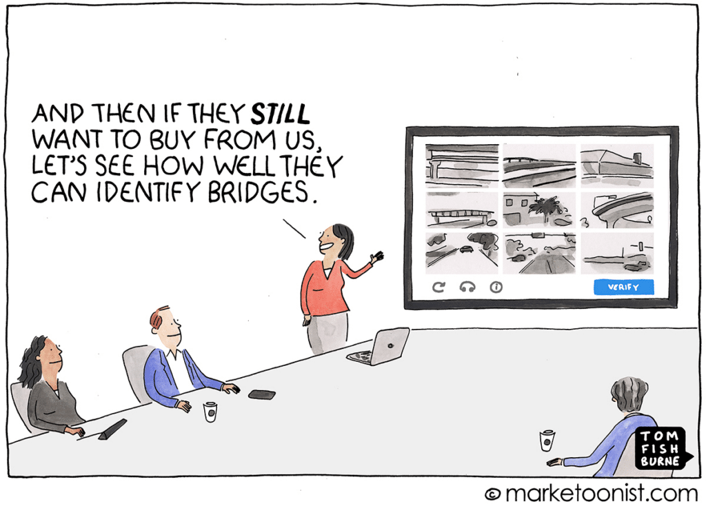
There is your user, ready to buy the products found in your easy-to-navigate, user-friendly, responsive website. At checkout, excitement and anticipation turn to frustration; the first requirement is to create an account. This feels unnecessary and time consuming. Still determined, but somewhat uncomfortable, the user proceeds, only to be faced with a seemingly endless form that asks for details that are totally irrelevant to the purchase.
Reluctantly, the user fills it out but then discovers an unexpected shipping fee, which increases the total cost significantly. Hoping to get it over with as soon as possible, the user tries to finalize the purchase, when an error message appears, as cryptic as ancient runes, offering no clue as to what went wrong or how to correct it. Each attempt to proceed results in the same frustrating outcome, with no support or guidance in sight. After many irritating tries, the user is about to finalize the purchase, but learns their preferred payment method is not accepted, the icing on a bitter cake that tastes like crap.
The bad news:
Exhausted and disappointed, the user abandons their cart, leaving behind the items, and any likelihood of ever returning. A frustrating checkout process is a barrier to conversion, eroding trust and driving potential customers into the arms of competitors.
The good news:
Fixing checkout usability issues alone can boost conversion rates by 35%.
The goal is to minimize friction and make the transaction as quick and effortless as possible, generally ensuring everyone (or at least, most people) will find options convenient to them.
And here’s another quick recap, this time on best practices in ecommerce UX design.
Mobile-First UX Design for Ecommerce
The shift towards mobile-first UX design is more than a trend; it’s a necessity. With an increasing number of consumers turning to their smartphones for shopping, ensuring your ecommerce site is optimized for mobile is crucial. This involves designing with mobile users in mind from the outset, focusing on aspects like:
Personalization is becoming increasingly important in creating a unique and engaging user experience. By leveraging data and insights into customer behavior, ecommerce sites can offer personalized recommendations, content, and offers that resonate with individual users. This level of customization not only enhances the user experience but also encourages loyalty and repeat business.
Ecommerce is no longer just a homepage with a banner and a few featured items. It takes a lot more to stand out. The trend is to shift from simple transactional sites to immersive experiences that tell a brand’s story. What used to be slow and expensive to develop is now just a couple of days of work away thanks to no code tools like Shogun, Livestory, Zmags, and Styla, which allow for the integration of rich media, interactive elements, and storytelling techniques that captivate users and differentiate brands in crowded marketplaces.
Using scarcity and FOMO can be effective in driving urgency and conversions, but it’s important to approach this trend ethically without resorting to tricks, misinformation or dark patterns. Real-time updates like “Only X left in stock” or “X people are viewing this product” can create a sense of urgency without resorting to manipulative tactics. The key is to use these elements truthfully and sparingly to enhance the shopping experience rather than to exploit users.
In addition to keeping up with trends, here are some key tips to consider in ecommerce UX design:
Providing robust customer support, including FAQs, live chat, and easy-to-find contact information, can significantly enhance the user experience.
Whatever you do to improve your customer experience can be measured. Therefore it is not an entirely subjective field and you should treat it as an iterative process of measurable improvements. Use analytics and user feedback to continuously measure and improve UX. Small, iterative changes can lead to significant improvements in user satisfaction and conversion rates.
Speaking of measuring, be consistent in your attempts to improve your product page, looking for marginal increases on conversion ratio per visitor through small tweaks. Some examples of elements to test and optimize regularly:
Loyal buyers go through three basic stages during their shopping journey. First they discover the brand, then they take action (the action of shopping), and then they should be nudged to become active amplifiers of your brand. Make sure you treasure and reward stage 3.
Brand Your Entire Experience: From discovery through purchase and post-sale, every interaction should reflect your brand’s values and style. Personal touches, such as branded packaging, thoughtful confirmation emails, encouraging users to leave reviews or social media shares, offering guides, tips or any other post-sale effort that improves a user’s experience, can help you turn customers into brand ambassadors.
Everything is broken, everywhere, all the time. Here are a few things to keep a close eye on:
Ecommerce UX design is an iterative process. You’ll never be done with it, and that’s a good thing, because it allows you to fix the things that don’t work and optimize those that do. Constant experimentation, learning, and refining based on user feedback and data will ensure your online store not only meets, but exceeds user expectations.
OK. Two more.
Tom Fishburne’s always-on-point Marketoons helped us illustrate this post.
If any of this feels like too much, don’t worry. Better Call Us. We can help.

How the small things make the biggest difference in life, love, and business, plus why microcopy is actually a big thing.

With new tech popping up left and right, B2B ecommerce evolves faster than you can say "shopping cart." What that means for eCommerce design? Glad you asked.

Websites that try too hard lose users, and money. Solid tips to turn digital lemons into gold, easy peasy. Plus Vincent Van Gogh analogies.

Because design is how it works, and how it makes you feel, ecommerce web design is also about differentiation and positioning.


